Beneath the Surface: Where Form Dissolves into Feeling
This piece feels different from the others.
Where some of my work begins with soft wisps of spray paint, this one began with wavy acrylic textures fanning out from its center, which I then covered with spray paint. I finished it with a sprinkle of glitter, because I am a fan of sparkle and wanted an extra something that felt whimsical. The whole piece lives in a soft pastel palette, and it reminds me of those quiet moments when big, fat snowflakes drift slowly right in front of your face. There is something about a deeply snowy day that softens the world and makes everything feel hushed, and this painting carries that same sense of quiet.
I wanted the surface itself to hold movement and give the eye a little extra dimension to play with. The ridges and raised areas create subtle movement, allowing light to interact with the painting in a way that shifts throughout the day. This texture represents experience: the unseen layers we carry, the imprints that shape us.
The color palette emerged intuitively—cool light blues, turquoise, warm yellows, soft violets, and plenty of pink, with a few white symbols woven throughout. These tones feel dreamy and fluid to me, almost like looking through snowfall or mist. There’s a sense of softness and submersion in this piece, as if the geometry isn’t sitting on top of the canvas but emerging from within it.
And that was intentional.
The patterns here are partially obscured. You can see fragments of structured forms—intersecting lines, hints of star tetrahedrons, faint floral geometry—but they aren’t fully revealed. They fade in and out, as if moving behind a veil.
This painting is about what lies beneath conscious awareness.
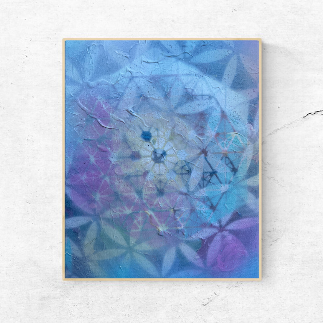
The central bloom-like shape feels almost organic, softening the rigidity of the geometric lines that surround it. I wanted to blur the boundary between nature and mathematics. After all, sacred geometry exists in petals, in cells, in galaxies. The difference between organic and divine structure is only perception.
The cooler blue and turquoise tones create calm and introspection. Purple invites intuition. Yellow brings warmth and light. The abundance of pink adds a sense of tenderness and heart, softening the entire composition and giving it a gentle, open presence.
What I love most about this piece is its quietness.
It doesn’t immediately declare itself. It requires you to slow down. To look again. To adjust your focus. From afar, it feels abstract—almost like snowfall, mist, or memory. Up close, the geometry begins to reveal itself, hidden in layers.
That duality mirrors inner work.
Sometimes we don’t see the patterns guiding our lives until we pause long enough to notice them. Sometimes structure is present even when everything feels fluid and undefined.
This piece is a reminder that sacred design doesn’t always appear sharp and symmetrical. Sometimes it’s soft. Sometimes it’s blurred by emotion. Sometimes it’s buried beneath experience.
But it’s still there.
Holding everything together.